How to Make a Scatter Plot in Google Sheets?
Learn to Make a Scatter Plot in Google Sheets. For creating a Scatter Plot in Google Sheets the step-by-step is included in this Article.
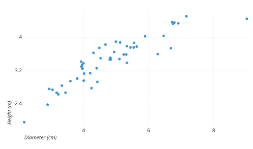
Creating a scatter plot in Google Sheets is an effective way to visualize the relationship between two sets of data. Scatter plots are used to plot data points on a horizontal and vertical axis, with each point representing the value of two variables. Here are the steps to create a scatter plot in Google Sheets:
- Open Google Sheets and create a new sheet or open an existing one where you want to create the scatter plot.
- Enter the data that you want to plot in two columns. For example, let's say you have a dataset of sales figures and advertising spending. You can enter the sales figures in column A and the advertising spending in column B.
- Select the range of data that you want to use for the scatter plot. In our example, we will select the range A1:B10.
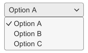
- Click on the "Insert" menu at the top of the page and select "Chart." This will open the "Chart editor" window.
- In the Chart editor, select the "Chart types" tab and choose "Scatter."
- In the "Customize" tab, you can make adjustments to the scatter plot's appearance, such as the color of the data points or the axis labels. You can also choose to display a trendline or add error bars.
- Click on the "Update" button to preview the changes you made. Once you are satisfied with the scatter plot, click on the "Insert" button to add it to your sheet.
- Finally, you can resize and move the scatter plot as needed by clicking on it and dragging it to the desired location.
In conclusion, creating a scatter plot in Google Sheets is a straightforward process that can be done in just a few steps. By following these steps, you can easily create a scatter plot to visualize the relationship between two sets of data.